Improving the Application Onboarding Flow
NinjaTrader is a futures trading fintech company based in Chicago, IL. They have over 600,000 users, with 300,000 daily active users for their web and mobile app. In 2023, focusing on growth, they began expanding into international markets after acquiring various competitors and taking strides towards increasing new users with the launch of the revamped marketing website, app updates, and a new application onboarding process at the end of the first quarter of 2023.
Client
NinjaTrader
Service
Date
2023 - 2024
My Role
Title: UX Strategist
Collaborators: Senior/Lead Product Designer
My Role/Duties: Primary Researcher
Project Overview
We discovered that out of 934,000 unique sessions, only 9% clicked through via the open account button, and only 2.8% of that 9% were confirmed to have submitted an application.
In our goal to understand why so many users failed to complete the application onboarding process, we conducted a usability research study. After working with 10 participants, we discovered one primary frustration and several subsequent ones:
The entire process lacked contextual information and had instances of vague or inadequate information.
The interface and instructions made it difficult for users to create a password.
All of the participants who made it to the end of the application struggled with the information review step.
The navigation between steps did not function intuitively, making the experience frustrating and delayed.
The user experience was average at best in comparison to competitors.
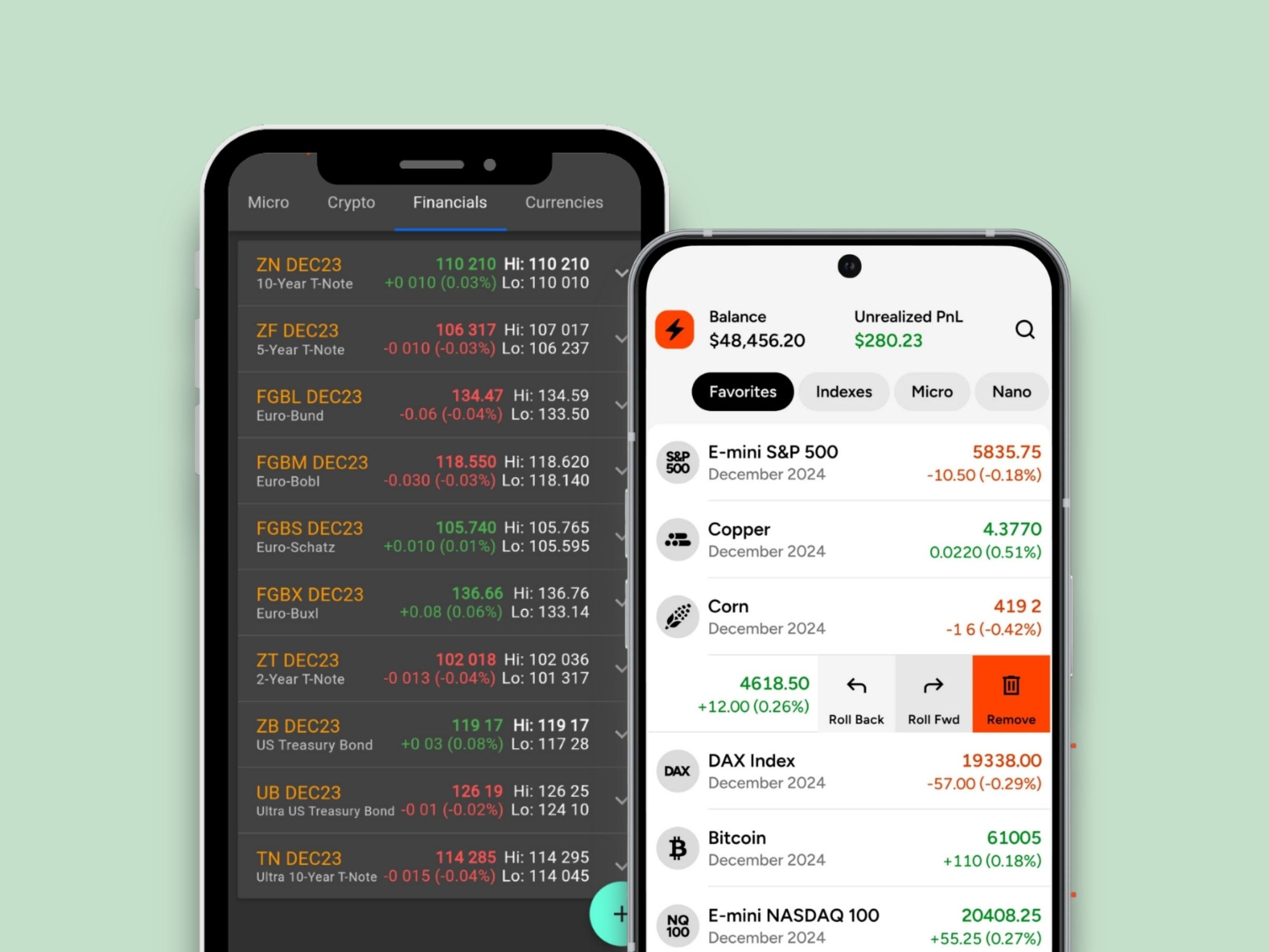
Below: the initial sign-up page redesign improved login and sign up options for users.


Key Highlights
All usability concerns were handed off to the development team with recommendations.
New design considerations were handed off to the lead product designer.
We implemented a new A/B testing protocol using Optimizely.
We tested one new iteration of the initial open account page and one of the sign-up pages within two weeks of our findings.
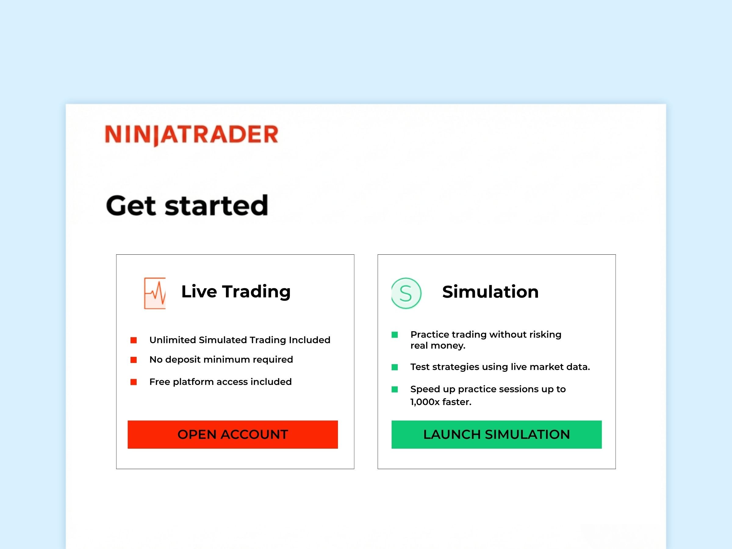
Below is a redesign of the application onboarding flow's initial page we began testing using Optimizely. A big contrast from the initial design at the top of the page.

Go Back